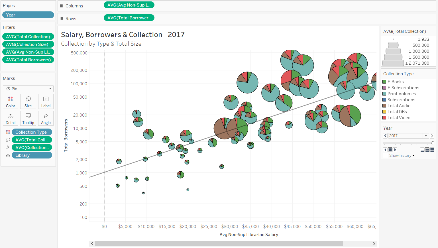

Motion Chart
Formulate Story
First consider which data you want on your axes—which data might be influenced by which other data.

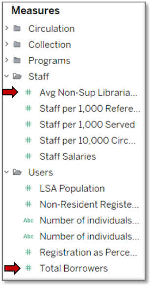
These fields need to be Measures, which are essentially numerical data that can be used in mathematic computations.
For this tutorial, we will examine the correlation between average salaries for non-supervising librarians and the total number of borrowers.
Frame Chart
- Expand a folder to access the fields grouped within.
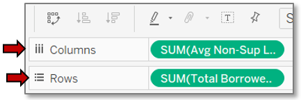
- Drag the average salaries field to Columns in the top, right pane. The columns are what will show on the horizontal, or bottom axis.
- Drag the total borrowers to Rows in the same pane. This will show on the vertical, or side axis.
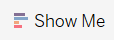
- From the Show Me pane, click the scatter plot.
- Toggle off the Show Me pane to give you more viewing space.

Set Aggregation
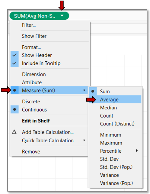
By default Tableau is summing data, so axis values are astronomical.
- Fix this by clicking the arrow to the right of each field and selecting Measure>>Average.
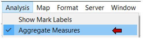
- Alternately, if you won’t be aggregating any data, turn off aggregation methods by clicking Analysis>>Aggregate Measures from the menu bar.
Setup Data Points
With the scatter chart skeleton in place, it’s time to fill in the chart.
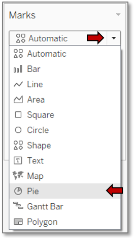
- Change the mark type to Pie via the Marks dropdown.
- Determine a field for your data points. This needs to be an entity, which in Tableau is a Dimension, or basically data on which mathematic operations cannot be performed.
- We’ll use libraries so we can get detailed information about the measures for each library.
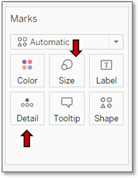
- Drag the library field to the Detail box in the Marks pane.
- Decide which measure to use for size. It should be something which may correlate with the other fields already used and which is closely tied to the data we will use for the pie chart sections.
- We will use the total collection size.
- Drag Total Collection onto the Size box in the Marks pane. If necessary, change the aggregation type to average.
Size Data Points
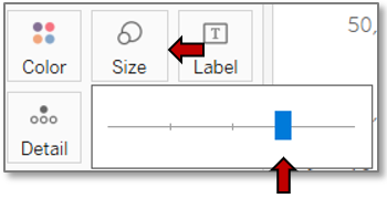
- Change the size of the data points to make them more legible by clicking on the Size box and moving the slider to the right.
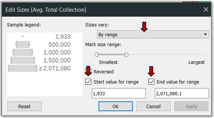
- For greater control over the size of the circles, click to the right of the size legend and select Edit Sizes…. Changing the sizes to vary by range can more accurately reflect size differences, especially when dealing with percentages. It also grants flexibility in setting the smallest size to ensure data points are visible.
- If the data range is too great for the smallest and largest data points to be meaningful, consider checking the boxes of the start and end values for the range to assign values before and beyond which the size will not change.
Configure Pie Charts
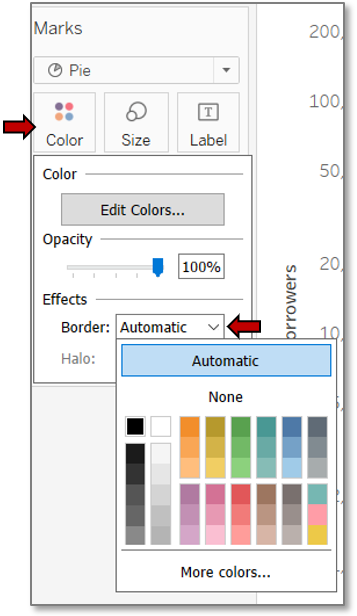
- Add a border to the pie marks to make them easier to distinguish by clicking on the Color box and choosing a color under Effects>>Border.
- Now add collection type detail to the pie marks.
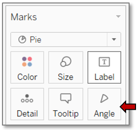
- Drag the Collection Type field to the Color box to color the pie slices.
- Drag the Collection Size field to the Angle box to size the pie slices.
Customize Color
- If the colors aren’t suitable, change them.
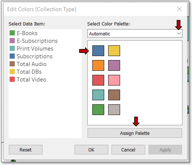
- Click on the Color box or on the arrow to the right of the Collection Type legend and select Edit Colors….
- Select a different palette from the drop down.
- Click on Assign Palette.
- Choose a different color from the displayed palette for the selected data item by clicking the color swatch.
- Change the color for the data item whose color you just used so each item has a unique color.
Edit Axis
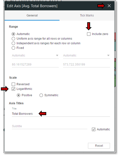
We’ve got a scatter chart with pie marks now, but the data points are essentially horizontal and vertical. This is because of the wide range of values in the total borrowers. We need to use a logarithmic scale to correct this.
- Right click on the y-axis and choose Edit Axis….
- A little over half way down, check the box for Logarithmic.
- Rename the axis for conciseness.
- Eliminate unused space and increase data density by unchecking the option for Include zero.
- X out of the dialog box.
Filter Data
Filter 0 values in Tableau rather than deleting them from Excel in case you need these records for other visualizations. Note: If some entities have 0 values for some periods but provide data for others, consider creating an untouched copy of the Excel file for future use and deleting from this file all records for an entity with any missing data to ensure trends can be spotted.
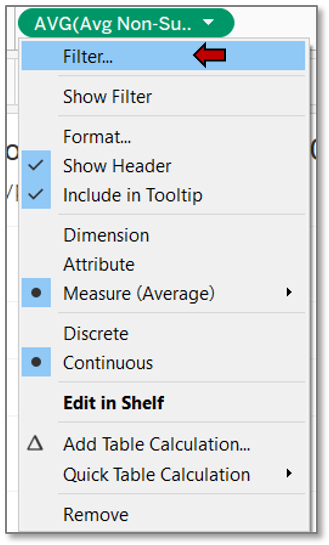
- Click on the arrow next to each measure in both the Marks pane and the Columns and Rows pane and choose Filter….
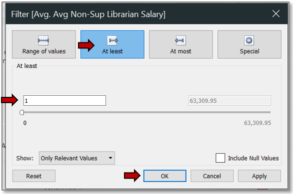
- Click on the At least tab and change the starting value to 1.
- OK out.
- Readjust the pie mark size at needed.
Animate Chart
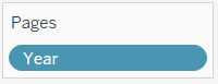
- Drag the Year field to the Pages pane in the top-middle of the window to add animation.
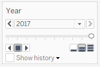
- A year navigation box has now appeared to the right, and clicking on an arrow to the right or left of the stop button will play the animation.
Set Trend Line
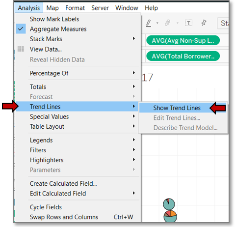
- Adding a trend line can help visualize the rate of change of salary to borrower size.
- Click on Analysis>>Trend Lines>>Show Trend Lines.
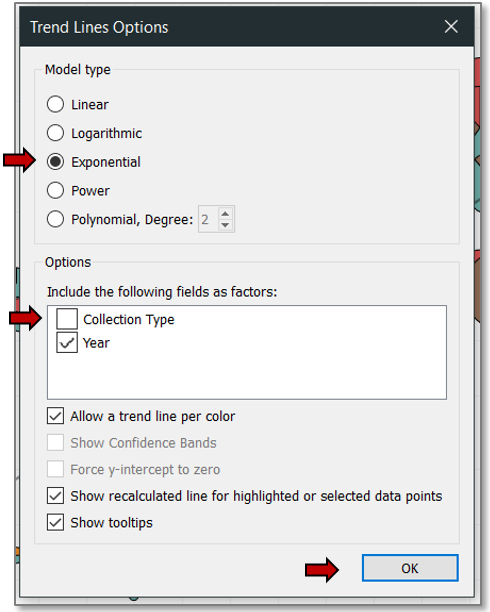
- Click on Analysis>>Trend Lines again, and this time choose Edit Trend Lines… to reduce the trend lines to one for the overall annual trend.
- Check the radio button next to the Exponential model type (necessary because of the logarithmic scale).
- Under Options>>Include the following fields as factors, uncheck the box for Collection Type.
- Hit OK.
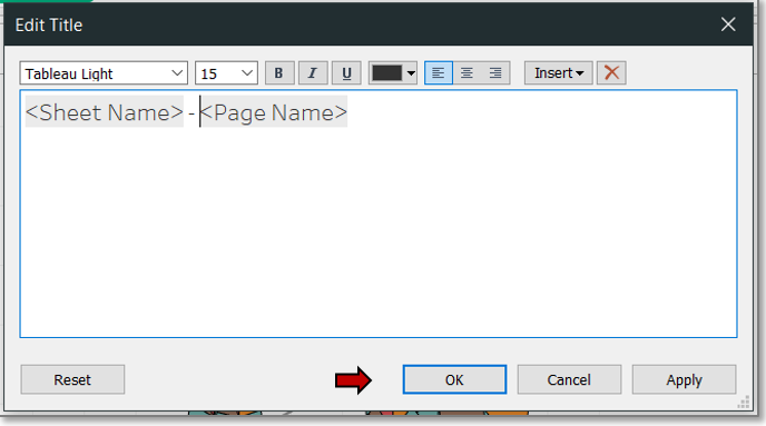
Edit Titles
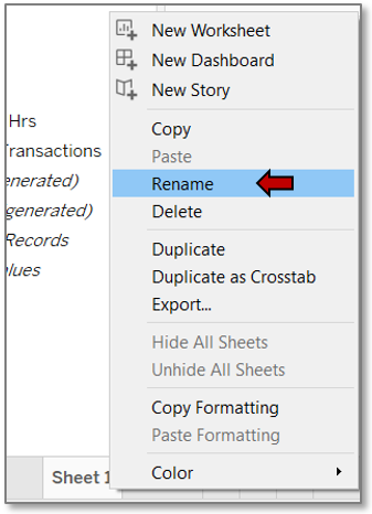
- Right click on the sheet tab and choose Rename. The sheet name you choose will be the default chart title, but we will change the chart title, so keep the worksheet title concise so you can fit in multiple sheets while still being able to recognize the tab.
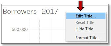
- Right click on the chart title and choose Edit Title…. The title should again be concise but clarify to viewers what they are seeing.
- Edit the formatting with the font, font size, and font color dropdowns, and the font style and alignment buttons.
- Hit OK.
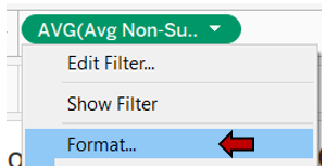
Format Currency
Since salaries are monetary, change the formatting to currency.
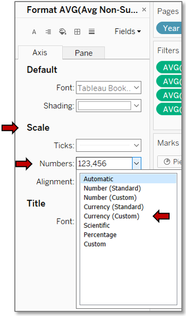
- Click on the arrow to the right of the salary field in Columns and choose Format….
- In the left pane under Scale, click the dropdown arrow to the right of Numbers.
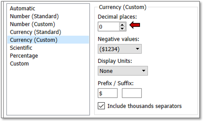
- Precision to the cent is not needed for this visualization, so choose Currency (Custom).
- Change the decimal places to 0 and click out of the dialog box.
- Go to the Pane tab and do the same thing for Numbers under Default, which will update Totals and Grand Totals.
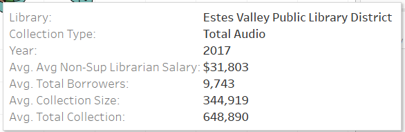
- Mouse over a data point to review the tooltip to confirm formatting.
- The tooltip still needs a little work to improve conciseness and clarity.
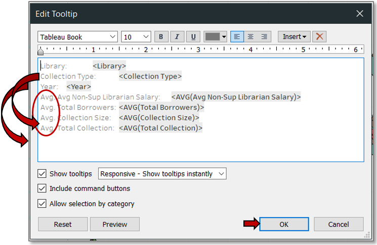
Edit Tooltip
- Remove “Avg.” from the tooltip field titles as appropriate, and rearrange the text to position it according to importance.
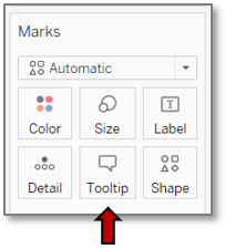
- Click the Marks Tooltip box.
- Edit the text.
- Press OK.
- Mouse over a data point once more to review the tooltip.
- Save your file.
You now have a motion scatter chart with pie charts!
Finished View