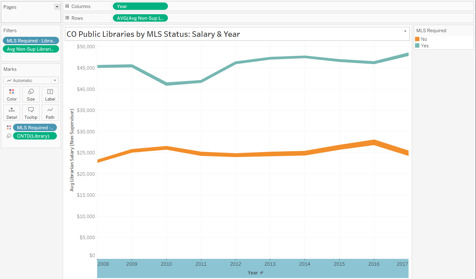

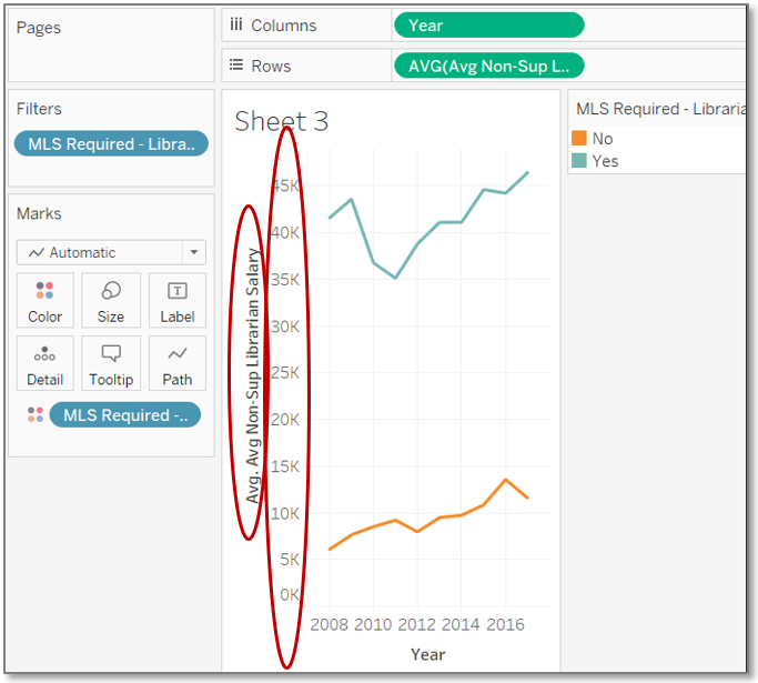
Line Chart
Setup Worksheet & Axes
- Once again, create a new worksheet on which to create the chart.
*See Symbol Map: Setup Worksheet for a review. - Our line chart will show change in salaries by required education level across time, so our axes will be for salary and year.
- Drag Year to the Columns.
- Drag the salary field to the Rows.
- In the Show Me chart pane, click the first line chart.
- Toggle the Show Me pane off.
- Change the aggregation type of the salary field to Average.
*See Motion Chart: Set Aggregation for a review.

Configure Color
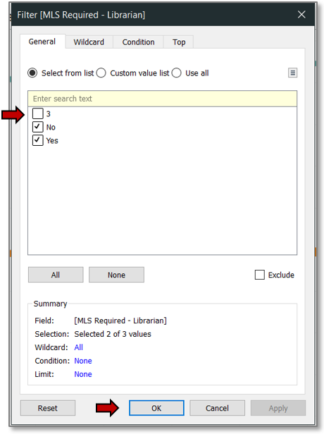
- Drag the MLS field to the Color Mark box.
*See Motion Chart: Configure Pie Charts for a review. - Filter out invalid MLS values, just as you did for salary info with the scatter motion chart, but this time uncheck the boxes next to invalid values.
*See Motion Chart: Filter Data for a review. - Hit OK.
Tidy Salary Display
Let’s clean up the salary display before proceeding.
- Format the field for the Axis and Pane.
*See Motion Chart: Format Currency for a review. - Edit the axis title.
*See Motion Chart: Edit Axis for a review.
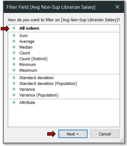
Filter Salary
- We also need to remove empty and 0 value salaries so they are not averaged into the output. For this, we must filter not via the averaged Row salary, but via another instance of the salary field used just for filtering.
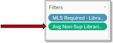
- Drag the salary field from the Data pane into the Filter pane (known as a Shelf Card in Tableau).
- Choose All values from the ensuing dialog box.
- Hit Next.
- Filter for values which are at least 1.
*See Motion Chart: Filter Data for a review.
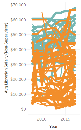
Size Lines
Let’s add a little more detail by setting the line size to vary by the count of libraries matching the criteria in a given segment.
- Drag Library to the Size Mark box.
- Wow! What a mess! This is too much for the layperson to make sense of.
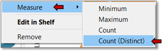
We need to consolidate the lines into just one for each MLS status. - Right click on the Library mark you just added.
- Choose Measure>>Count (Distinct).
- Adjust the line size just as you did for circles and pie charts.
*See Motion Chart: Size Data Points for a review.
Tidy Legends & Tooltip
We have just a few pieces to tidy up before we finish.
- Rename the MLS legend title for conciseness.
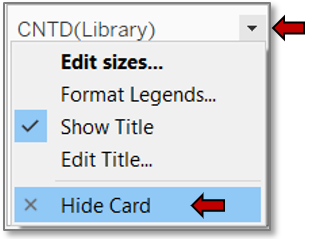
*See Symbol Map: Edit Legend Title for a review. - Hide the CNTD(Library) Legend.
- Click to the right of the legend title.
- Click on Hide Card.
- Edit tooltip labels.
*See Motion Chart: Edit Legend Title for a review.
Edit Axis
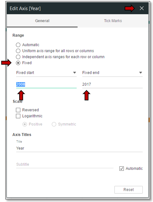
- Edit the year axis to eliminate wasted space.
*See Motion Chart: Edit Axis for a review. - From the Edit Axis [Year] dialog box, click on the Fixed radio button.
- Change the Fixed start and Fixed end text fields to the actual start and end values of the data.
- X out.
Edit Titles
- Rename the worksheet.
*See Motion Chart: Edit Titles for a review. - Edit the chart title.
- Save.
You now have a line chart!
Finished View