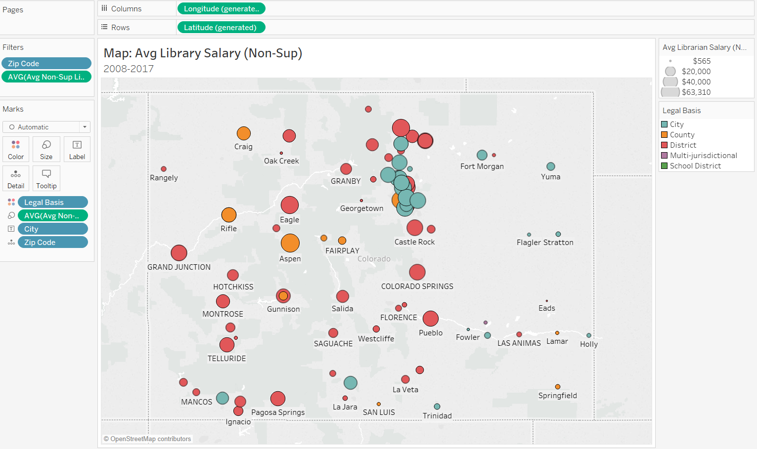

Symbol Map
Setup Worksheet
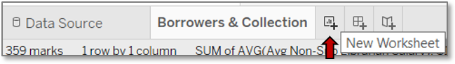
- Create a new worksheet on which to create the map.
- Click on the tiny chart with a plus sign icon to the right of your current worksheet at the bottom of the window.
- Drag location information to the Columns. Use the zip code for the greatest precision.
- In the Show Me chart pane, click the symbol map icon to confirm the type of chart so Tableau will translate your data to coordinates.
- Toggle the Show Me pane off.

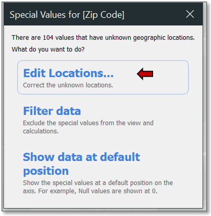
Edit Locations
Only a few library locations are showing, and no cities are labeled. Remedy this with a few steps:
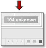
- Click on the 104 unknown message at the far bottom right of the window.
- Click on the Edit Locations… option from the dialogue box that opens.
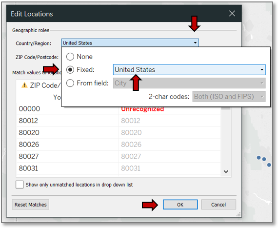
- Under Geographic roles>>Country/Region, click on the drop down and select the Fixed radio button and United States from its drop down menu.
- Note that all but one issue has resolved, and it’s for an invalid 00000 zip code.
- OK out, and then take a peek at the data to see which library used this zip code.
Review Data
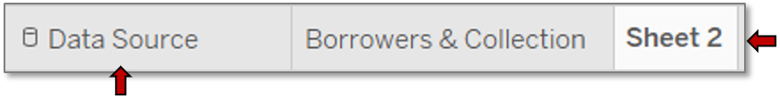
- Click on the Data Source tab at the bottom of the window.
- Mouse over the Zip Code header.
- A sort button appears to the right. Click on it to reverse the sort order.
- Drag the Library column border to increase the width so the full name can be seen.
- The library name doesn’t explain the invalid zip code, but scrolling across the record reveals that no data was entered for this library at all, so it can be safely filtered out.
- Click on Sheet 2.

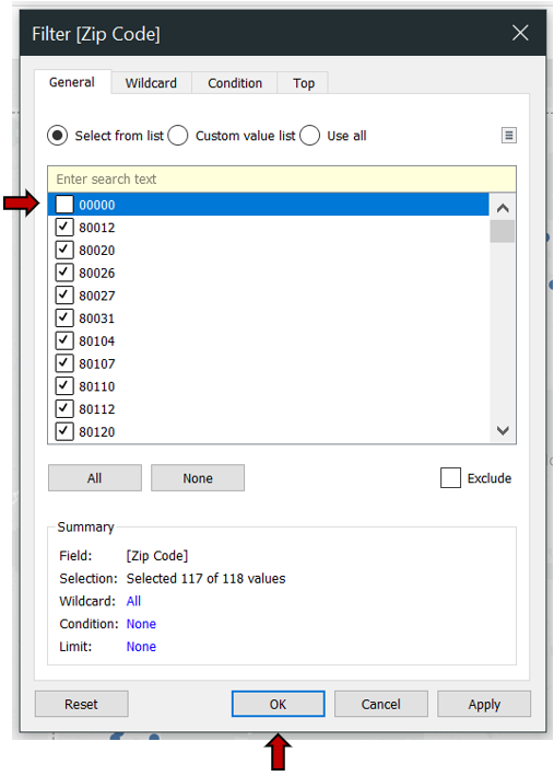
Filter Locations
- Click to the right of the Zip Code Detail mark.
*See the motion chart for a review. - Choose Filter….
- Uncheck the box next to 00000.
- Hit OK.
Add City Labels
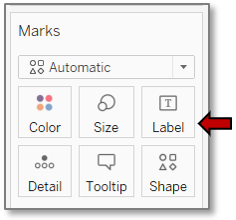
- Drag the City field to the Label box to add in the city names.
- Not all cities are labelled, but this will vary with the zoom level.
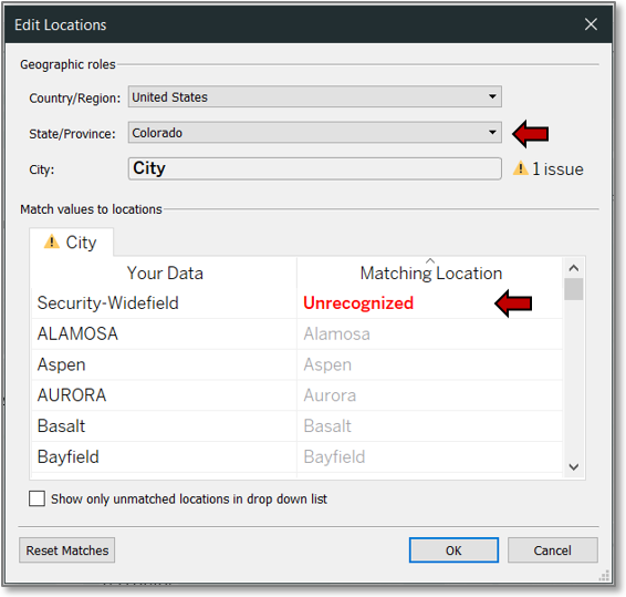
- Once again, location ambiguities must be corrected.
- Click the 71 unknown message in the bottom right of the window.
- Click Edit Locations….
- Select Colorado from the State/Province>>Fixed dropdown.
- Security-Widefield is still unrecognized.
Research Data Anomalies
A quick web search for “Security Widefield Colorado public library” reveals that Security is the library name, it serves the Widefield school district, and it is located in Colorado Springs. Therefore, assign the library to a known location.
- Click on Unrecognized under Matching Location.
- Select Colorado Springs from the dropdown menu.
- If you encounter a city for which you cannot determine a recognized location for the unknown data, simply filter it out as you did for zip codes.
- OK out.
Configure Measures

A map of the public libraries in Colorado now shows, and it’s time to start adding measurements to the data points, keeping in mind the overall focus of salary.
- Drag the average non-supervising librarian salary field out of the Staff folder to the Size box.
*See the motion chart for a review. - Change the aggregation method under the mark’s Measure option to Average.
*See the motion chart for a review. - Change the size of the circles via the slider accessed through the Size box.
*See the motion chart for a review.
Configure Color
Choose a dimension which might be correlated with salary to differentiate the data points by color. For this tutorial, use the legal basis—the type of library.
- Drag Legal Basis to the Color box.
*See the motion chart for a review. - To better differentiate the data points, add a border to them.
- Click the Color box and select a color from the Effects>>Border dropdown.
Filter Salaries
At this point you can see that some data points are just dots. These are probably libraries which did not report salary data and can be filtered out.
- Click to the right of the salary Mark field.
*See the motion chart for a review. - Choose Filter….
- Click the At least button.
- Set the value to 1.
- OK out.
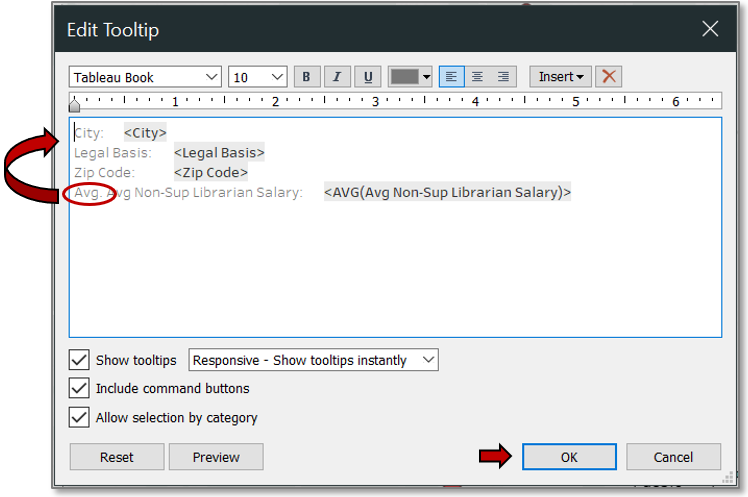
Tidy Display Details
A few display details need to be improved for conciseness and clarity.
- Remove “Avg.” from the tooltip field title, and rearrange the text to position it according to importance.
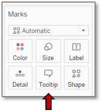
- Click the Tooltip box.
- Edit the text.
- Press OK.
Mouse over a data point to double check how the tooltip now displays.
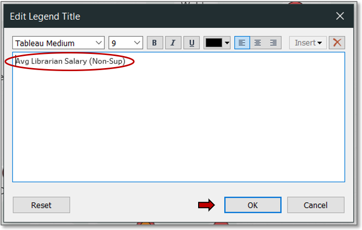
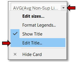
Edit Legend Title
- Clean up the title in the legend to move the important information to the front so it fits in the legend window and push the non-essential information to the end where it is still available.
- Click to the right of the legend title.
- Choose Edit Title….
- In the text box alter the title.
- OK out.
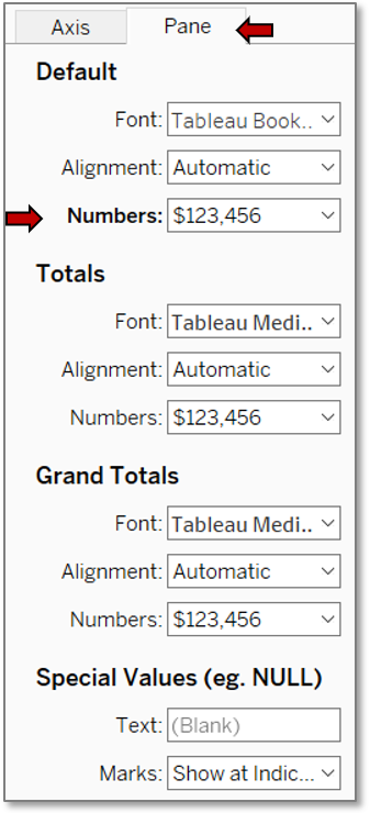
Format Currency
- In the tooltip, the salaries show no currency symbol, so format that field.
- Click to the right of the salary Mark field.
* See Motion Chart: Format Currency for a review. - Select Format….
- The axis doesn’t show in this chart, so we won’t need the Axis tab this time.
- Click the Pane tab.
- Choose Currency (custom) from the Numbers dropdown under Default.
- To conserve space, change the number of decimal places to 0.
- Click out of the dialog box.
Edit Titles
- Double click the sheet name to rename it using a concise title that will still clearly inform you which worksheet is which.
*See Motion Chart: Edit Titles for a review. - Right click on the chart title to rename it.
- Choose Edit Title….
- In the text box type a concise title which also explains to the users what the chart is showing them. Maintain consistency across charts with bolding and font size.
- Hit OK.
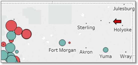
Your map is ready to go!
Finished View