
Dashboard
Create a Basic Dashboard
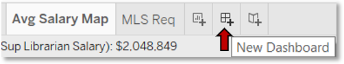
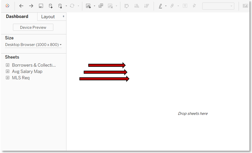
At the most basic level, creating a dashboard is easy.
- Click on the New Dashboard grid icon from the bottom tabs.
- Drag the worksheets you already created to the right pane.
Enable Highlighting
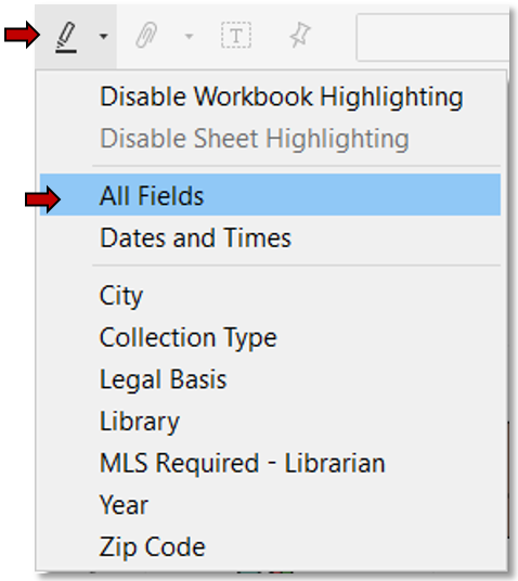
Next, ensure that when a data point is clicked on one chart, it is highlighted on the other charts.
Note: This only works for fields which are common to each chart.
- From the toolbar at the top, click on the highlighter icon.
- Select All Fields.
Rethink the Basic Dashboard
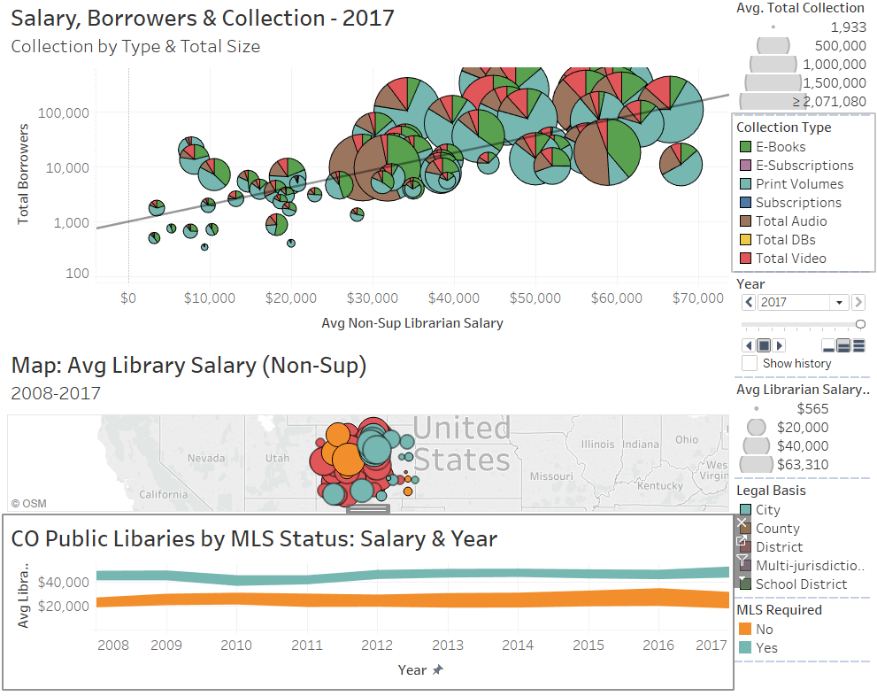
As you can see, corrections to this quick and easy dashboard are needed to make it visually sound. This applies not just to the layout, but also to the consistency of visual cues between the worksheets on the dashboard.
Adjust Basic Layout
Let’s start by addressing the basic layout so you can see those visual cues.
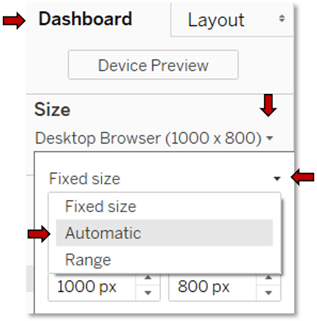
- In the Dashboard pane, click on the dropdown below Size.
- Click the dropdown arrow to the right of Fixed size.
- Select Automatic. This allows Tableau to resize to match the screen size.
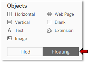
- Click on the Floating button at the bottom of the Dashboard pane under Objects. This will let us to independently resize objects and move them out of the fixed grid.
Consider Clarity
Before we start refining the formatting, consider whether all the worksheets should be included on the dashboard. To be included, a chart should be clear to understand within the context of the dashboard.
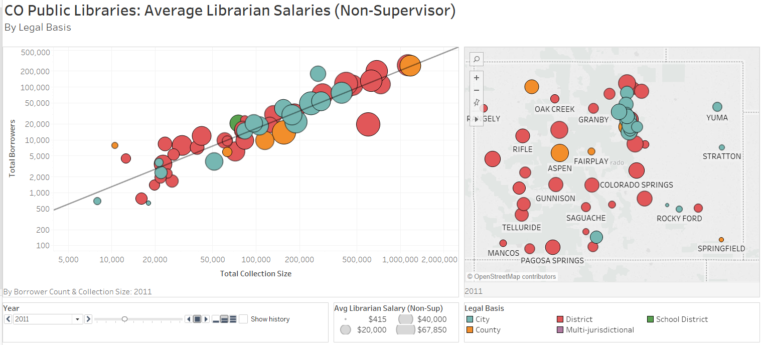
In our dashboard, clicking on a point in the line chart only highlights the data point in the scatter chart if it happens to be showing the same year; it does not advance the scatter chart to that year. At a glance, it seems like the scatter chart has no corresponding data points, which could confuse the viewer. The map chart also does not sync, but this can be corrected by adding Year to the Pages shelf. The line chart, however, specifically shows change over time and cannot be so easily correct. As it stands, this disconnect undermines the ease and efficiency of reading the visualization, so remove the line chart from the dashboard.
Remove Unclear Chart
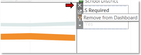
- Click the line chart.
- Click the X at the top corner (it may be on the right or left side).
Assess Visual Cues
Now consider the scatter chart.

The size of the circles draws the attention, shifting it to the collection size they represent and away from salary. The pie charts themselves, with all the information they display, overload the dashboard. Also, the same colors are used in the pie chart as in the map, but they mean different things, which can further confuse the viewer.
To be the most efficient and easiest to understand, size and color—two primary visual cues—should be consistent between charts so viewers don’t have to remember different associations for the same visual cue. Anything more involved should be developed through a story, building from easy to hard to train the viewers.
Duplicate Original Chart
To implement this strategy, duplicate the existing scatter chart (so you still have the collection visualization for reference), and modify it.
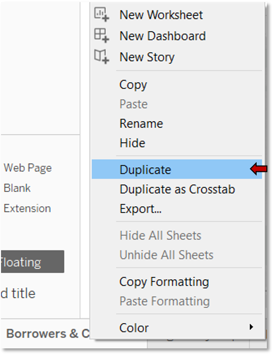
- Right click the scatter chart tab at the bottom of the window.
- Select Duplicate.
- Rename the new worksheet to clarify that it is the one with pie charts.
- Click on the original worksheet tab.
Note: We’re modifying not the duplicate but the original worksheet to maintain its connection in the dashboard.
Edit Chart
- Change the Marks to Circle.
*See Motion Chart: Setup Data Points for a review. - Remove the Collection Type Color Marks field and the collection size (type-specific as opposed to total collection) Detail Marks field.
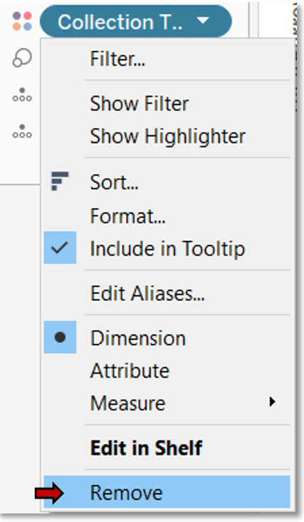
- Right click the field.
- Select Remove.
- Drag Legal Basis to the Color Marks box.
*See Motion Chart: Configure Pie Charts for a review. - Swap the collection size and salary fields by dragging them from their shelves to each other’s shelves.
Edit Chart Scale & Trend Line
As we can now see, the range of the collection size is too vast for a linear axis scale.
- Change the x-axis to a logarithmic scale.
*See Motion Chart: Edit Axis for a review. - A good deal of wasted white space now precedes our data points.
- From the Edit Axis… dialog box, uncheck Include zero.
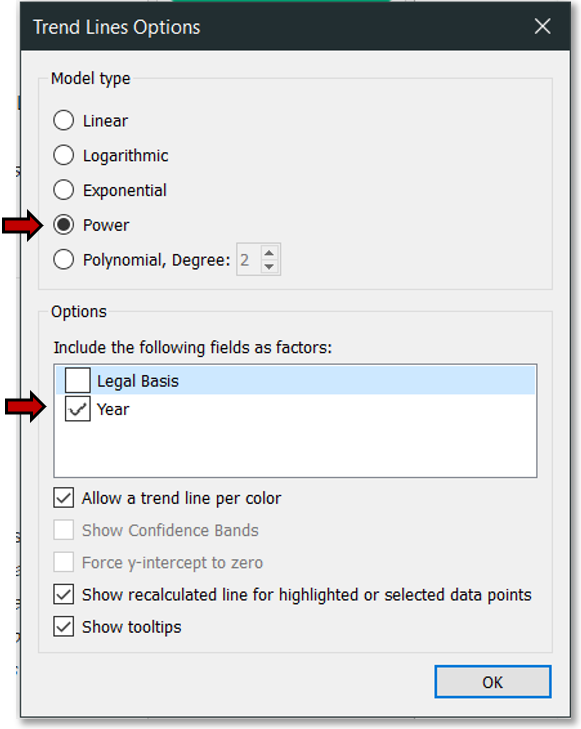
*Also see Motion Chart: Edit Axis for a review. - Reduce the trend lines to a single line and correct its angle.
- From Trend Line Options, remove the extra trend lines so only that for year shows.
*See Motion Chart: Set Trend Line for a review. - Set the Model type to Power.
Tidy Chart Display
A few things need to be cleaned up.
- Edit the axis title.
*See Motion Chart: Edit Axis for a review. - Edit the chart title.
*See Motion Chart: Edit Titles for a review. - Edit the legend title.
*See Symbol Map: Edit Legend Title for a review. - Edit the tooltip to remove unnecessary aggregate terms and to rearrange fields in order of importance.
*See Motion Chart: Edit Tooltip for a review. - Mouse over a data point to double check the tooltip.

Page Chart Years
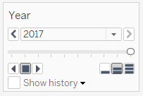
As mentioned previously, we need to page the years for the map and configure it to link to the scatter chart.
- Click on the map worksheet tab.
- Drag Year to the Pages shelf.
*See Motion Chart: Animate Chart for a review.
Coordinate Size
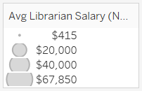
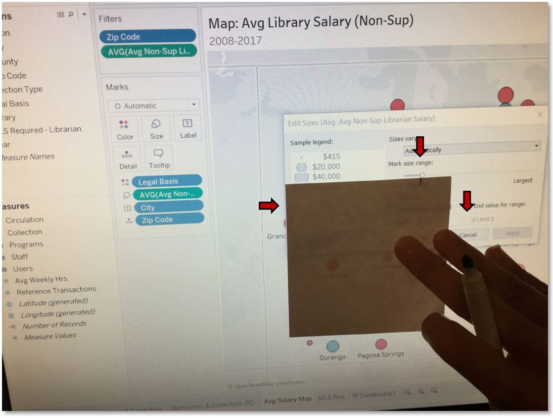
Now we’ll coordinate the data point sizes using the map sizing, as the scatter chart sizes would be too large for the map.
- Switch to the map worksheet.
- Go to Edit sizes… from the size legend.
*See Motion Chart: Size Data Points for a review. - Grab a piece of paper and a soft-tip marker. (Tableau offers insufficient options to do this precisely in the program.)
- Hold the paper up to your screen so that the edge aligns with the left border of the dialog box.
- Make a mark at the edge of the paper where the inner border of the right slider is.
- Cancel out.
- Add Library to the Detail Mark box so both
charts have the same details and will highlight each other when a data point is clicked.
*See Motion Chart: Setup Data Points for a review. - Switch to the scatter chart.
- Go to Edit sizes… from the size legend.
*See Motion Chart: Size Data Points for a review. - Hold the paper up to your screen so that the edge aligns with the left border of the dialog box.
- Adjust the slider so the inner border is directly above the mark on the paper.
- OK out.
Fine Tune Layout
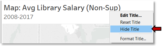
Our dashboard now uses visual cues consistently, so let’s move on to the finer details of the layout. Start by removing the chart titles to eliminate their redundant text, and plan on adding a dashboard title to provide overall information, and captions to note chart-specific descriptions.
- Right click a chart title.
- Select Hide Title.
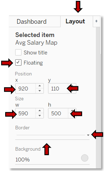
- Now, resize the map to eliminate the wasted space on either side, and then reposition it.
- In the left pane, click on the Layout tab.
- Check the box next to Floating.
- Under Position, set x to 920 and y to 110.
- Under Size, set w to 590 and h to 500.
- Let’s also delineate our objects.
- Click the arrow to the right of Border.
- Select the solid line, and change its color to a light gray which won’t draw the eye but will still lend a subtle border.
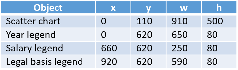
Repeat the steps for the scatter chart and legends.
Note: The dimensions you use will vary according to your screen size, as Tableau does not offer the option to set size and position by percentage to take advantage of the automatic sizing when floating objects.
Suggested layout settings:
Adjust Legend Columns
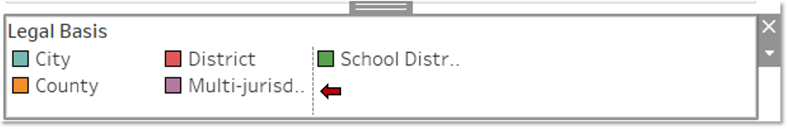
With the color legend’s shorter size, the column widths need to be adjusted.
- Hover the cursor to the left of the third column until a double-sided arrow and a dashed line appear.
- Drag the arrow until the full text of each library basis shows.
Note: Tableau does not allow each column to be independently sized. The size you select applies to every column.
Create Dashboard Title
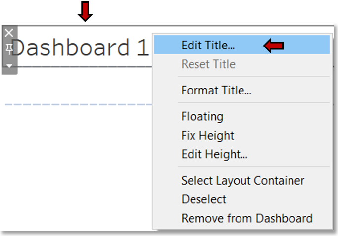
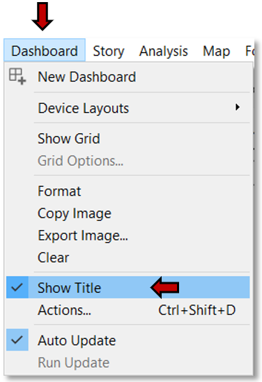
We now have room for a dashboard title.
- Click on Dashboard in the menu bar.
- Select Show Title.
- Right click on the title.
- Choose Edit Title.
- Edit the title just as you did for chart titles.
*See Motion Chart: Edit Titles for a review.
Create Captions
Add the chart caption.
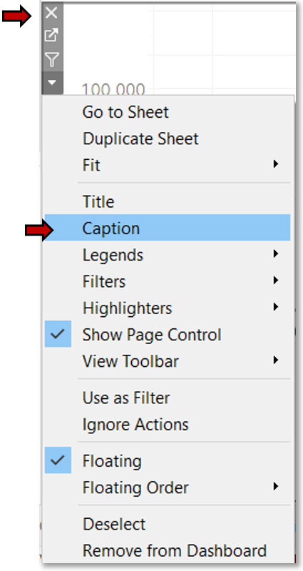
- Click on a chart.
- Click the arrow in the top corner. The arrow may be on either the right or left side.
- Select Caption.
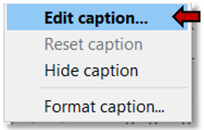
- The caption by default is quite verbose. Make it succinct.
- Right click on the caption.
- Select Edit caption….
- Modify the caption as you would a chart title.
*See Motion Chart: Edit Titles for a review.
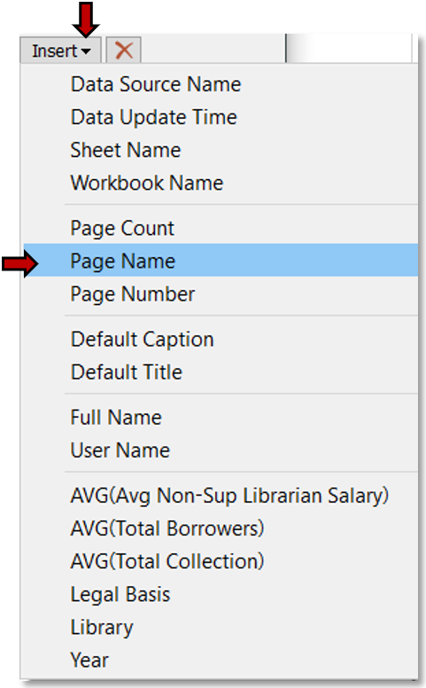
Add Year to Caption
Unfortunately, Tableau does not facilitate the inclusion of the currently viewed year in the dashboard title, so we’ll include it in the captions.
- Click on the Insert dropdown.
- Choose Page Name.
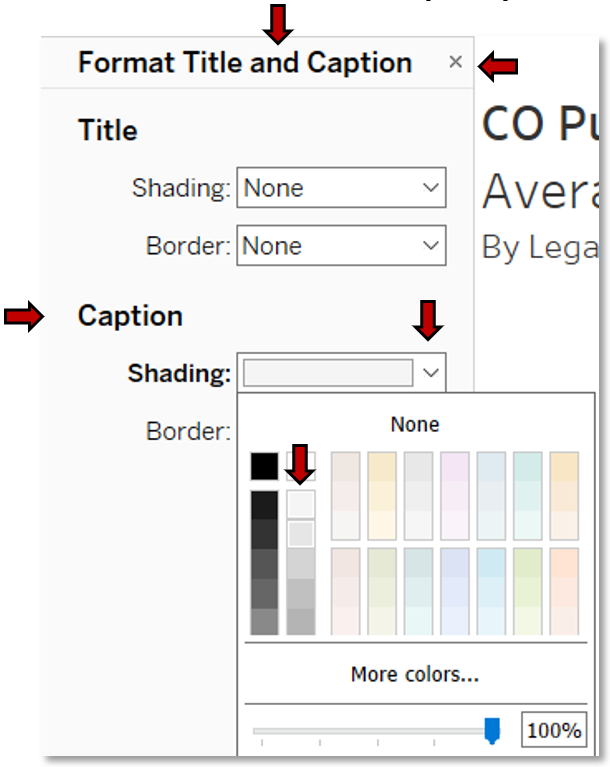
Format Map Caption
Now the map caption is too stark and should be formatted to draw less attention.
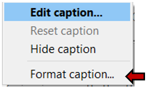
- Right click on the caption.
- Select Format caption....
- From the Format Title and Caption pane which appears to the left, under Caption, choose a light gray from the Shading dropdown.
- X out.
Format Map Background
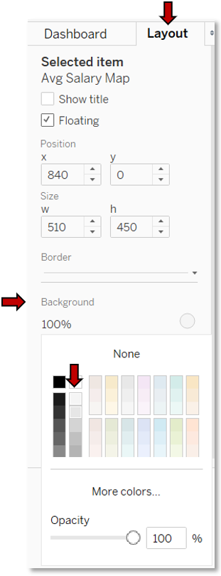
- While the map is still selected, click on Background from the Layout pane on the left.
- Select the same light gray.
- Rename the dashboard sheet.
*See Motion Chart: Edit Titles for a review.
You now have a dashboard! Give it a whirl!
Finished View